Alliance for Vehicle Efficiency (AVE)
Mission-focused, accessibility-first website MVP
Alliance for Vehicle Efficiency (AVE), a non-profit organization based in Washington D.C., wanted to simplify their website in a way that clarified their mission and put their main goals and objectives first. This meant showing who is part of the alliance and the specific things they are doing to make vehicles more efficient.
As designer and developer, my goal for MVP was to simplify the website's overall experience so that, rather than having to go to multiple pages to read key bits of information, the key information would sit upfront on the home page. This meant simplifying the website's architecture while leaving room for future site pages.

Post-Discovery Accessibility Audit
In the absence of past user testing data and historical website analytics, I needed a starting point to figure out other possible pain points as part of discovery - things that might not be as immediately obvious as an overly complex website architecture. So I conducted an initial manual accessibility audit of the website by testing with a keyboard and VoiceOver for iOS. I also did an automated accessibility scan using TPGi's ARC Toolkit browser extension. Since the majority of the website's components were featured on the home page and reused elsewhere, the bulk of my testing could be done here.
- Missing skip link
- Incorrect heading structure and semantics
- Color contrast failures in the header, hero banner and cards
- Missing alt text in photos
- No visible focus states on links for keyboard users
- Auto-scrolling carousel
The accessibility audit gave me additional starting points for UX while still being able to use their branding assets in a more inclusive way.
Simplified website architecture
The original Alliance for Vehicle (AVE) website contained short bits of information that were scattered among multiple pages - approximately one paragraph of information per page. Much of the content was also redundant and could be consolidated. For example, "Our purpose" and "About" content could be combined together.
Color Palette
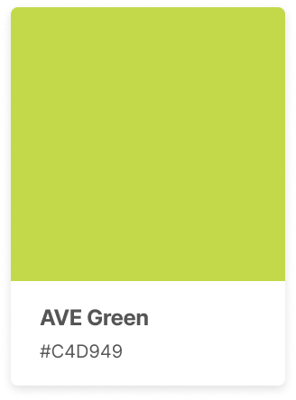
I isolated colors from AVE's logo to create both branding and utility color tokens for development.


Color Contrast Testing
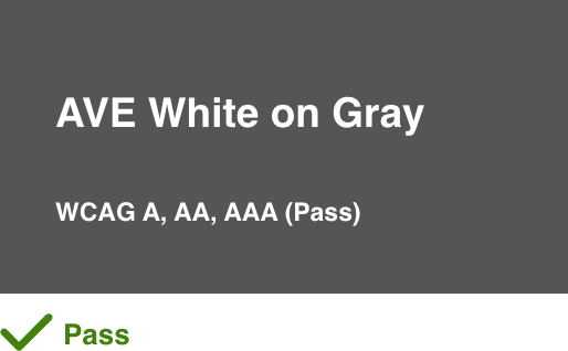
Using TPGi's Colour Contrast Analyzer, I tested each color combination to allow me to best use them in the UI.
Colors over white backgrounds


White over color backgrounds


Sketches and Wireframes
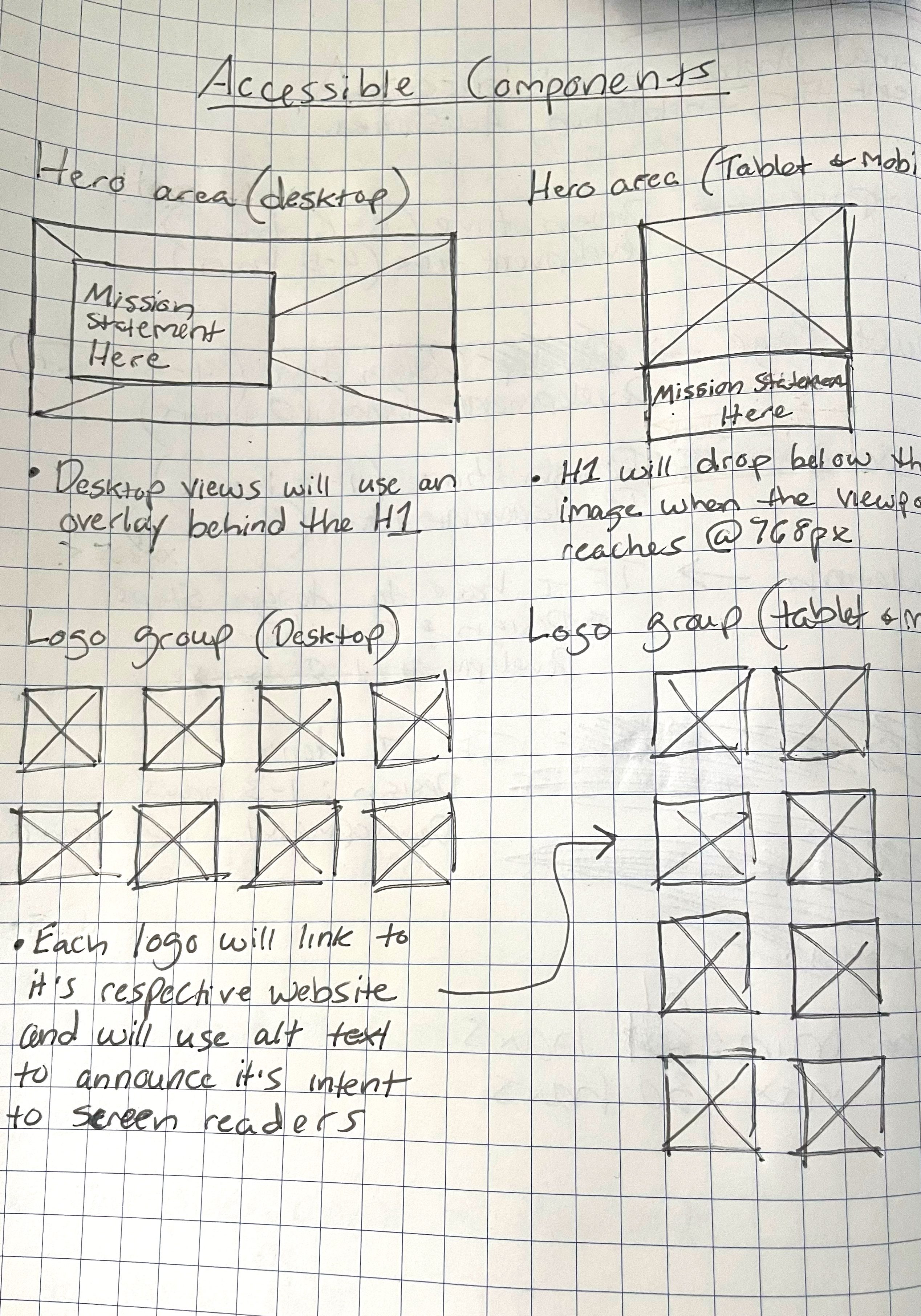
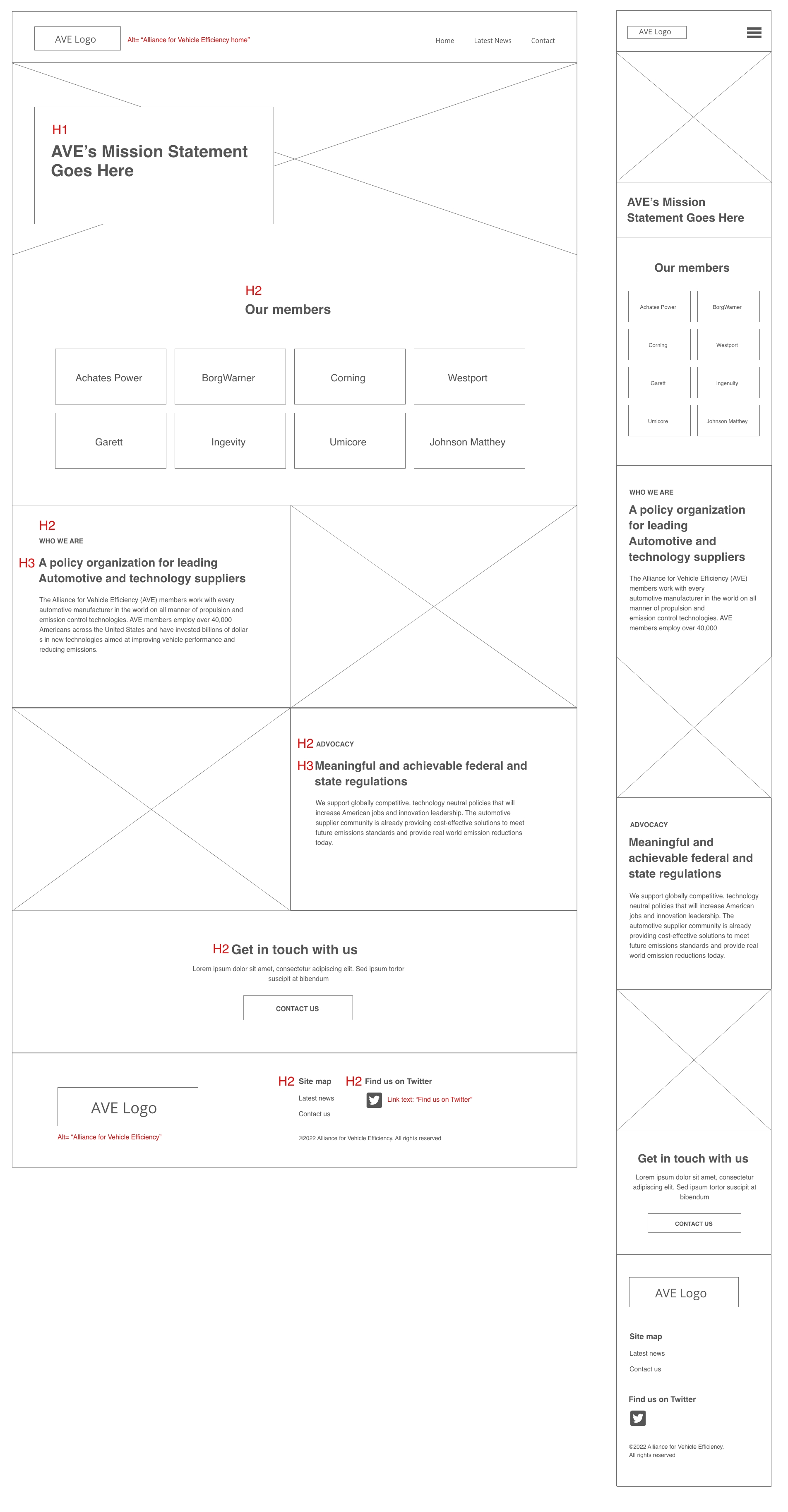
I started with sketches that explore both how to make existing components on the website more accessible, such as the hero area and the AVE member logo group. The wireframes include the home page's heading structure, link text and alt text for screen reader users.
Typography
I chose Inter for it's clean, legible style and created the typography using a modular type scale.
Initial Typography Doc

Initial Type Scale

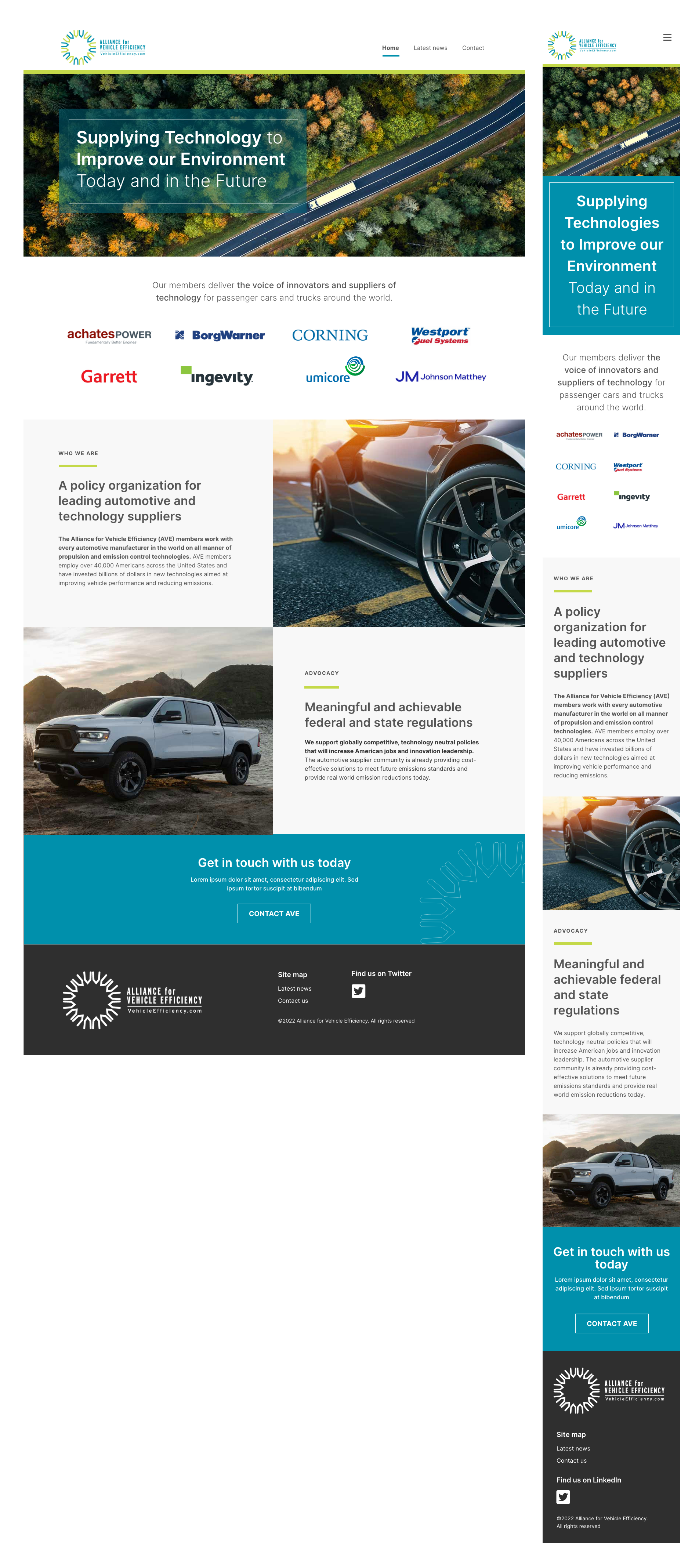
Final UI Screens
Post MVP Next Steps
The website was launched February 2023 and will continue being iterated on as-needed. The next steps are to create a customized blog template for press releases and to create profile pages for each member of AVE.


