Website Redesign
Simplified information architecture and website refresh.
Company Overview
Moose Tracks® is a legendary flavor concept and licensing powerhouse owned by Denali Flavors Inc. Rather than manufacturing physical pints, the company utilizes an innovative B2B licensing model, partnering with independent dairies and major grocery chains across North America to distribute its iconic recipe. Moose Tracks is one of the most recognizable names in the frozen novelty industry.
Challenge
As Moose Tracks' product offerings and content grew, the website became increasingly difficult to navigate, making it harder for users to discover products, recipes, and brand initiatives. The site also lacked prominent visibility for the company's philanthropic efforts and did not fully reflect the fun, family-friendly personality of the Moose Tracks brand.
Solution
Transform the digital experience by simplifying product discovery, increasing visibility of key philanthropic initiatives, improving content findability through enhanced categorization, and strengthening the brand's playful identity.


User Stories and Website Architecture
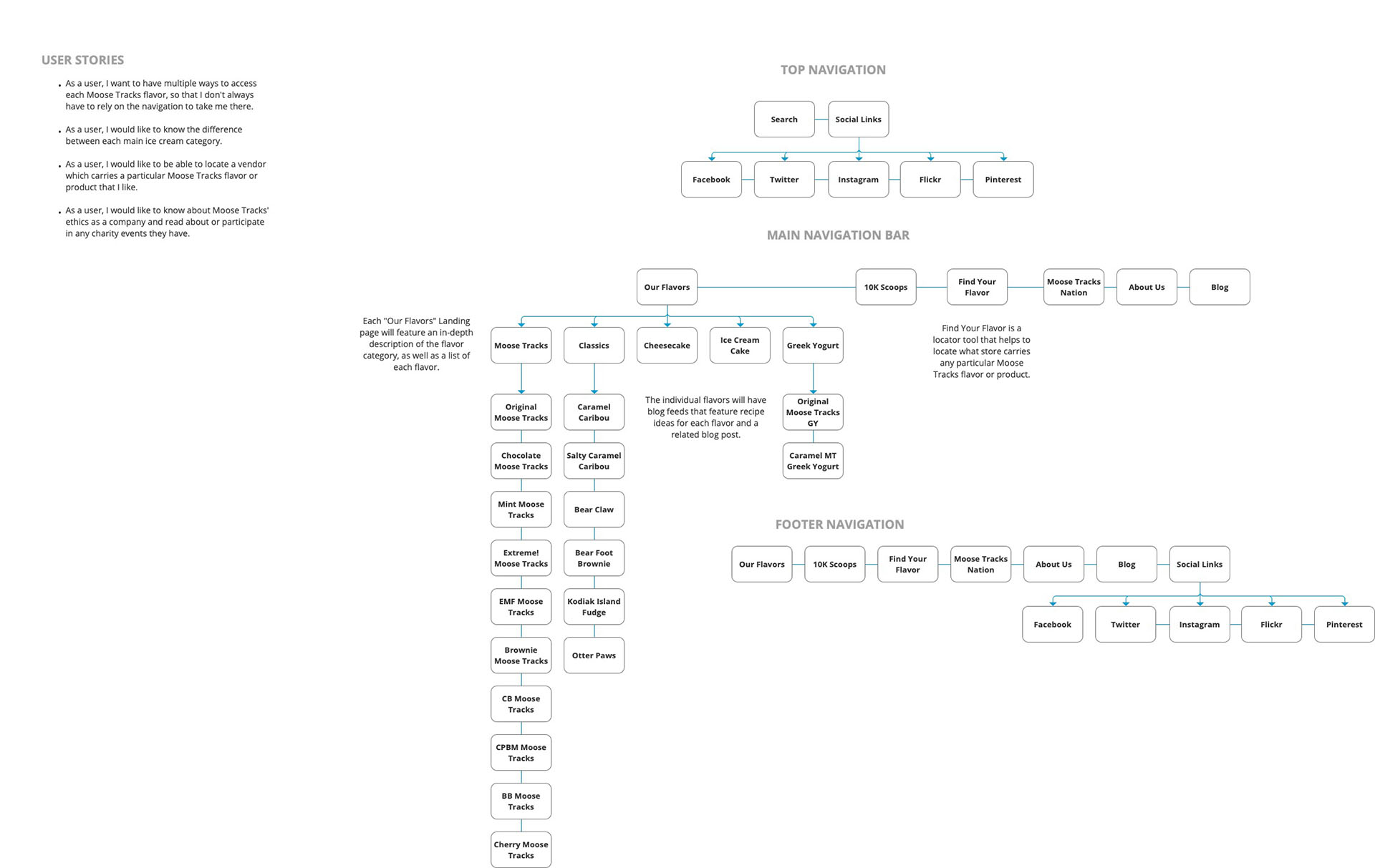
Our first step in the design process was to re-work the website architecture according to a set of predetermined user stories. We took the goals of our client into consideration and created the user stories based on those goals. From there, we prioritized each navigation element based on importance highlighted in those stories.
Mood Board
I did thorough competitive analysis of other websites in the food and beverage space to see what features they might have been using for their website, as well as how they manage to make their brands seem more appealing. This gave me a sense of what types of stylistic elements to use, as well as types of fonts. I put together a mood board to give our client a sense. of what their website content could look like.

Color Palette


Typography

Layout Wireframes
After we established the company’s new architecture, fonts and colors, we moved on to the layout of the website’s key pages. We started off very low-fi with sketches and moved through mid-fidelity wireframes. These were used internally amongest the design team and not pitched to the client.
Low-Fidelity Sketches

Mid-Fidelity Wireframes


Final UI Screens


Outcomes From The Redesign
According to Moose Tracks' marketing team, the company saw a growth in users by more than 50% since launching. Some of it could be attributed to organic growth of the Moose Tracks Nation fan club, but it spiked after the redesign in ways that it never had before. With the improved mobile experience, as well as the more intricate funnels we set up, users are spending more time on our website and viewing more pages per session overall.